# Light and Dark Mode
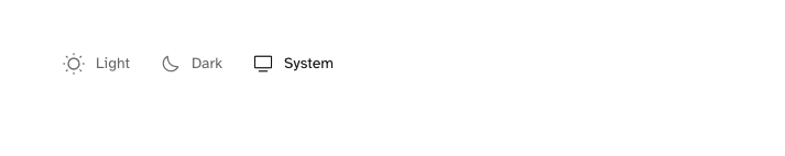
Galerie has three appearance modes: Automatic (default), Light and Dark. The user can set the preferred mode from the main menu.
# Automatic
The Automatic mode is selected by default, it adapts automatically according to the user's operating system preferences.
# Light
The Light mode is used when the user explicitly selects this mode from the menu or if the Automatic mode is enabled and the user's operating system has the light mode enabled. If the user selects this mode from the menu, this mode will remain activated regardless of the operating system mode unless the user selects another mode.
The color palette of the Light mode is as follows:
<style>
  :root {
    --foreground: hsl(0, 0%, 7%);
    --background: hsl(0, 0%, 100%);
    --header-background: rgba(255, 255, 255, 0.5);
    --gradient-card-background: rgba(255, 255, 255, 0);
    --light-background: hsl(0, 0%, 91%);
    --light-secondary-background: hsl(0, 0%, 98%);
    --accent-color: hsl(0, 0%, 7%);
    --border: hsl(0, 0%, 91%);
    --light-text: hsl(0, 0%, 36%);
  }
</style>
Changing the colors of the Light mode is very easy, for example, if you want to change the background color you can inject the following code in the Ghost Admin (Settings --> Code injection --> Site Header):
<style>
  :root {
    --background: #fff1e6; /* You can use any color you want */
  }
</style>
# Dark
The Dark mode is used when the user explicitly selects this mode from the menu or if the Automatic mode is enabled and the user's operating system has the dark mode enabled. If the user selects this mode from the menu, this mode will remain activated regardless of the operating system mode unless the user selects another mode.
The color palette of the Dark mode is as follows:
<style>
  [theme-mode="dark"] {
    --foreground: hsl(240, 25%, 98%);
    --background: hsl(245, 17%, 12%);
    --header-background: rgba(27, 26, 37, 0.5);
    --gradient-card-background: rgba(26, 25, 36, 0);
    --light-background: hsl(225, 13%, 18%);
    --light-secondary-background: hsl(225, 13%, 8%);
    --accent-color: hsl(32, 100%, 49%);
    --border: hsl(228, 13%, 23%);
    --light-text: hsl(240, 25%, 78%);
  }
</style>
The process to change the colors of the dark mode is the same, for example, if you want to change the background color you should inject the following code:
<style>
  [theme-mode="dark"] {
    --background: #14213d; /* You can use any color you want */
  }
</style>
TIP
You can of course change any color you want to adapt the color palettes to your needs, feel free to play with the color values, just remember not to change the name of the variables.